V1: strictly typographic (no graphics or images)

V2: type + graphics (no image)
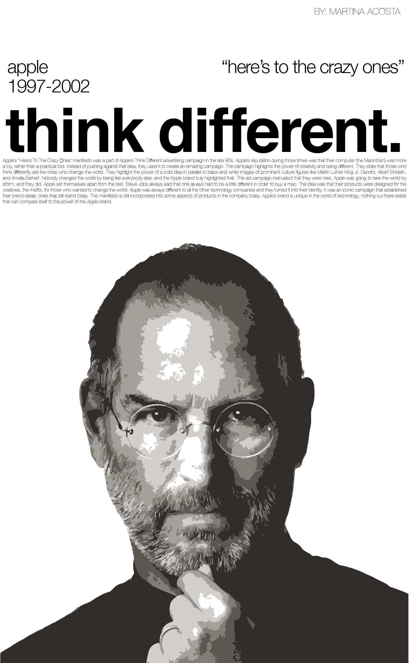
V3: type + image
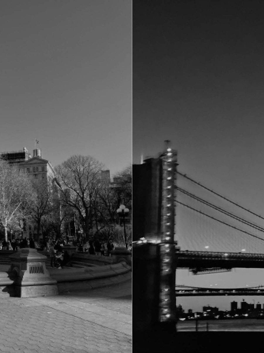
Goal: The objective of this project was to design three distinct posters featuring Apple's "Here's to the Crazy Ones" manifesto, each with a different approach to typography, graphics, and images. Experience: Version 1: Strictly Typographic In this version, I focused solely on type, manipulating the font by extending ascender and descender heights to create visual interest. The body text was divided into four blocks with flush alignment, adding structure while emphasizing the manifesto’s flow. I experimented with the spacing and layout to achieve balance without using any graphics or images. Version 2: Type + Graphics For the second version, I incorporated graphic elements while keeping the text the focal point. The heading was flush left with increased leading, and the subtitle was flush right to balance the composition. To evoke Apple’s branding, I added pops of color inspired by their 1997 logo, demonstrating hierarchy through the varying sizes of the title, subtitle, and graphic elements. Version 3: Type + Image In the third version, I aimed for a magazine cover aesthetic, combining type with a bold image. The title’s tracking was adjusted for a tighter, impactful look, and the subheadings were spaced apart to maintain balance. The large image at the bottom served as the main focal point, reinforcing the manifesto’s theme of bold, innovative thinking. Outcome: The final posters successfully conveyed Apple’s manifesto, with each layout offering a unique interpretation.
V1: strictly typographic (no graphics or images)
V2: type + graphics (no image)
V3: type + image